.avif)
The Q-Spread is a quantitative benchmark representing the theoretical upper bound of Day-Ahead arbitrage revenue for an energy storage asset. It measures the price differential between the highest and lowest price intervals.
Q1 and Q2 design based on 2025, 17th June price curve. Q1 is the standard Max-Min spread. Q2 averages the top 2 and bottom 2 extremes.
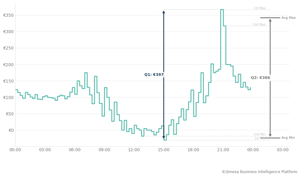
Note: This analysis is based on Sequence 2 (EXAA, Gate Closure 10:15 CET).
Formula: Daily Q-Spread. For any specific day \( d \), the Q-Spread \( S_{d,Q} \) is calculated as:
$$S_{d,Q} = \frac{1}{Q} \sum_{i=1}^{Q} \left( P_{\text{max}, i} - P_{\text{min}, i}\right)$$
Where:
\( Q \) = Number of 15-min intervals (e.g., for a 2-hour battery in a 15-min market, \( Q=8 \) )
\( P_{\text{max},i} \) = The \( i \)-th highest price on day \( d \).
\( P_{\text{min},i} \) = The \( i \)-th lowest price on day \( d \).
Example: The Q-spread \( S_{d,8} \) denotes the maximum value in EUR/MW that can be achieved with a two-hour battery on day \( d \).
Volatility is not uniform. To build a robust business case, we aggregate daily data into statistical percentiles. This allows us to separate "business as usual" from high-value outlier events:
The gaps between P10, P50, and P90 are effective KPIs for hourly price volatility and can be intuitively visualized. Figure 1 illustrates the quarter-hourly price curve and the resulting spread depth. With increasing $Q$ the spread naturally decreases as it absorbs less extreme price spreads. The curve acts as a "speed limit" – a physical asset cannot capture more revenue (on a particular market) than the Q-Spread for the respective duration
Note: To grasp the seasonal pattern of volatility, e.g., due to weather and demand shifts, a Q-spread analysis on quarterly granularity can reveal further insights.
Structural Volatility vs. Pre-Crisis Baselines. Historical data analysis shows that the (German) power market has shifted into high intraday spreads and higher spread volatility. Disregarding the unprecedented price volatilities of 2022, the power market intraday spreads and spread volatility have increased since 2019, with 2025 (so far) attaining new peak levels.
Revenue Scenarios: The Volatility Risk Premium (P50 vs. P90). BESS revenue potential is characterized by a significant "opportunity premium". Figure 2 compares the P50 and P90 Q-Spreads. The data shows a wide divergence: the P90 spreads are nearly double the P50 values for the same duration. This confirms that a substantial portion of annual value is concentrated in a minority of high-volatility days.
P50 and P90 minus P50 Q-Spread curves for 2019-2025.
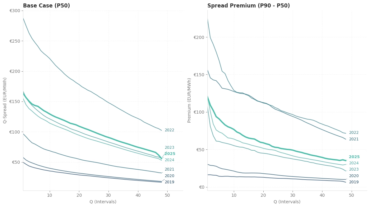
Note: 2025 is represented by available data up to 2025, 16th December.
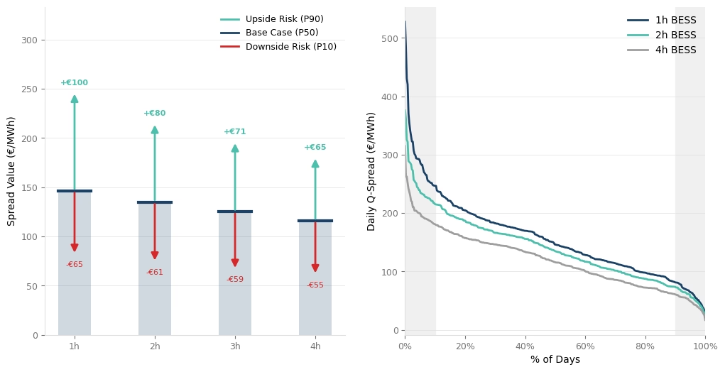
The 2025 Q-Spread data indicates distinct performance profiles across different battery durations.
Average 2025 spread values by asset class and opportunity curve.
The 2025 power market data demonstrates a persistent volatility premium compared to pre-crisis levels. The historical Q-Spread curves highlight that value is increasingly concentrated in sub-hourly intervals (Q1–Q4) and high-spread tail events (P90). For asset owners, this data underscores the necessity of 15-minute optimization strategies to capture the full depth of the available spread.
At Qmesa, we don't just model these spreads; we help you capture them. From market-based Q-Spreads to grid-constrained Flexible Boundaries, we structure the risk-return profile of your entire flexibility portfolio.
Ready to analyse your asset’s true potential? Contact us at markus@qmesa.eu to model your specific case.